Pencil: One workspace for thousands of AI-generated ads
Pencil lets global brands generate ad creatives with AI at massive volume. Creating content was easy. Managing it was not. I redesigned the core workspace where teams organise, find and act on their work, and built the component system that let us ship it in nine sprints. It is still in production more than a year later.
Role
Product Designer, owning UX/UI and the design system
Worked with
Product Manager, engineering team, Head of Product Design, stakeholders
Pencil is a generative AI advertising platform owned by The Brandtech Group, with partners including Google, Meta, Amazon, TikTok and OpenAI. Brands use it to generate ad creatives, predict how they will perform, and scale them across markets. Pencil has publicly reported over a million creatives generated, with predictions trained on more than $1 billion of real media spend.
The users.
Campaign and creative teams at global brands. A single campaign can produce hundreds of outputs a week: creatives, variations, images, videos and copy, multiplied across languages, formats and ad placements.
02The problem
The problem
Pencil had solved content creation. It had not solved what comes after it.
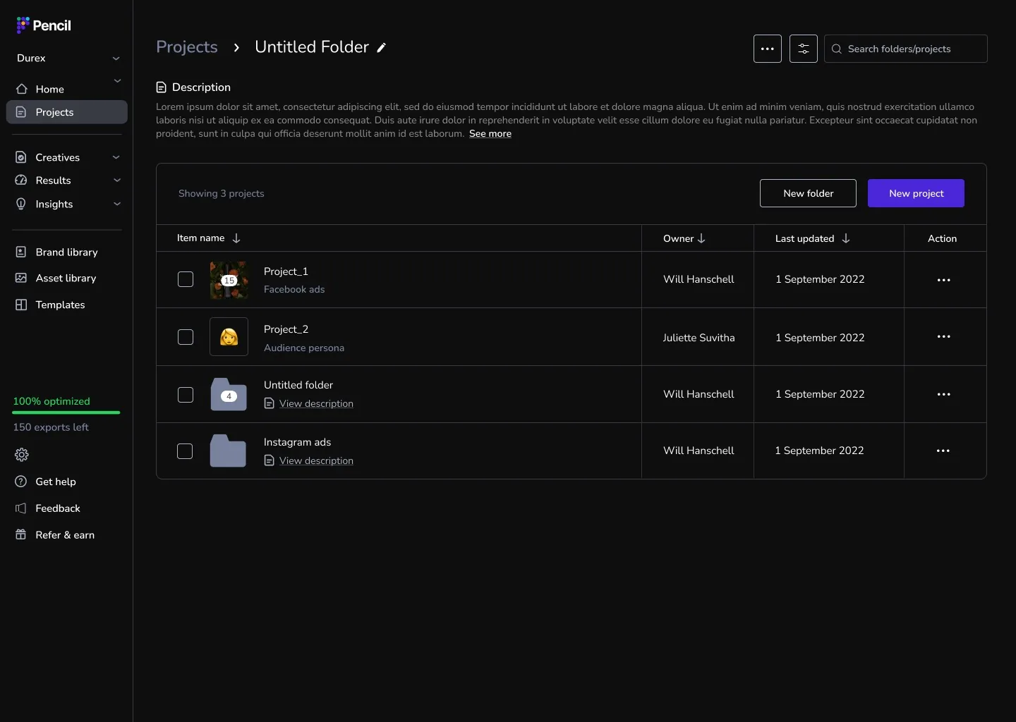
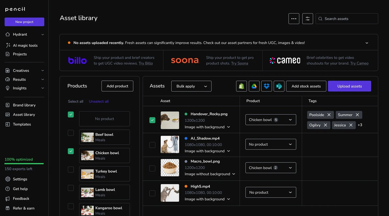
Everything a team produced was split across four pages: Projects, Creatives, Asset Library and Template Library. Each had its own navigation, its own folders and its own rules. For a team handling hundreds of outputs, that meant:
1
One folder per item.
A campaign running across several markets and formats had no natural home.
2
One item at a time.
Renaming, labelling or exporting meant repeating the same action for every file.
3
Hard to find anything.
No global search, and no way to filter across pages.
4
Four products in one.
Every page had its own top bar and conventions, so nothing felt connected.
The volume that made Pencil valuable was the same thing making it hard to use.
Before: the Projects page. Single-level folders, no labels, no bulk actions.Before: the Asset Library. Its own rules, disconnected from every other page.
The goal.
With the PM and stakeholders, we framed the redesign around three promises to users:
1
See all your outputs in one place.
2
Organise, filter and sort content easily.
3
Act on many files at once.
The real challenge was adding that much power without making the product harder to learn.
03My role
My role
I was the product designer on the redesign, from the first audit through to production.
UX & UI
Improved the UX and UI of the content-management experience and the wider Pencil platform.
Design system
Part of creating the Pencil design system, building reusable components other features and designers could build on.
Handoff
Documented and handed over the design to engineering, screen by screen and state by state.
Briefing
Briefed and explained the design to the team and stakeholders so everyone worked from the same picture.
Research
Ran customer interviews to ground the work in real user needs.
Collaboration
Coordinated closely with the engineering team and the PM throughout.
Beyond the screens, my job was to keep product, engineering and design working from the same picture. The backlog and the component library were how I did that.
04Approach
How the work ran
1
Start with evidence
I audited the full experience across all four pages: every screen, state and dead end. I documented where patterns were inconsistent, where the same behaviour had been built twice, and where users hit walls. That audit became the reference point for every decision after it, so debates were settled with evidence rather than opinion.
2
Turn findings into a shared contract
With the PM, I turned the audit into a living backlog of 130+ user stories, each tagged by page, feature area and status. It became the agreement between design and engineering. Every component I designed mapped to a story, which kept scope conversations fast and specific.
3
Design the system, then the screens
Instead of designing four pages separately, I designed the shared parts first: the header, filter dropdowns, sort bar and label management. Each page was then assembled from those parts. Once a component was approved, it worked the same way everywhere it appeared.
4
Ship with engineers, not at them
I worked through feasibility with engineers throughout the project and adjusted designs where the build cost was higher than the value to users. I ran design QA against the build all the way to production.
05The solution
The solution
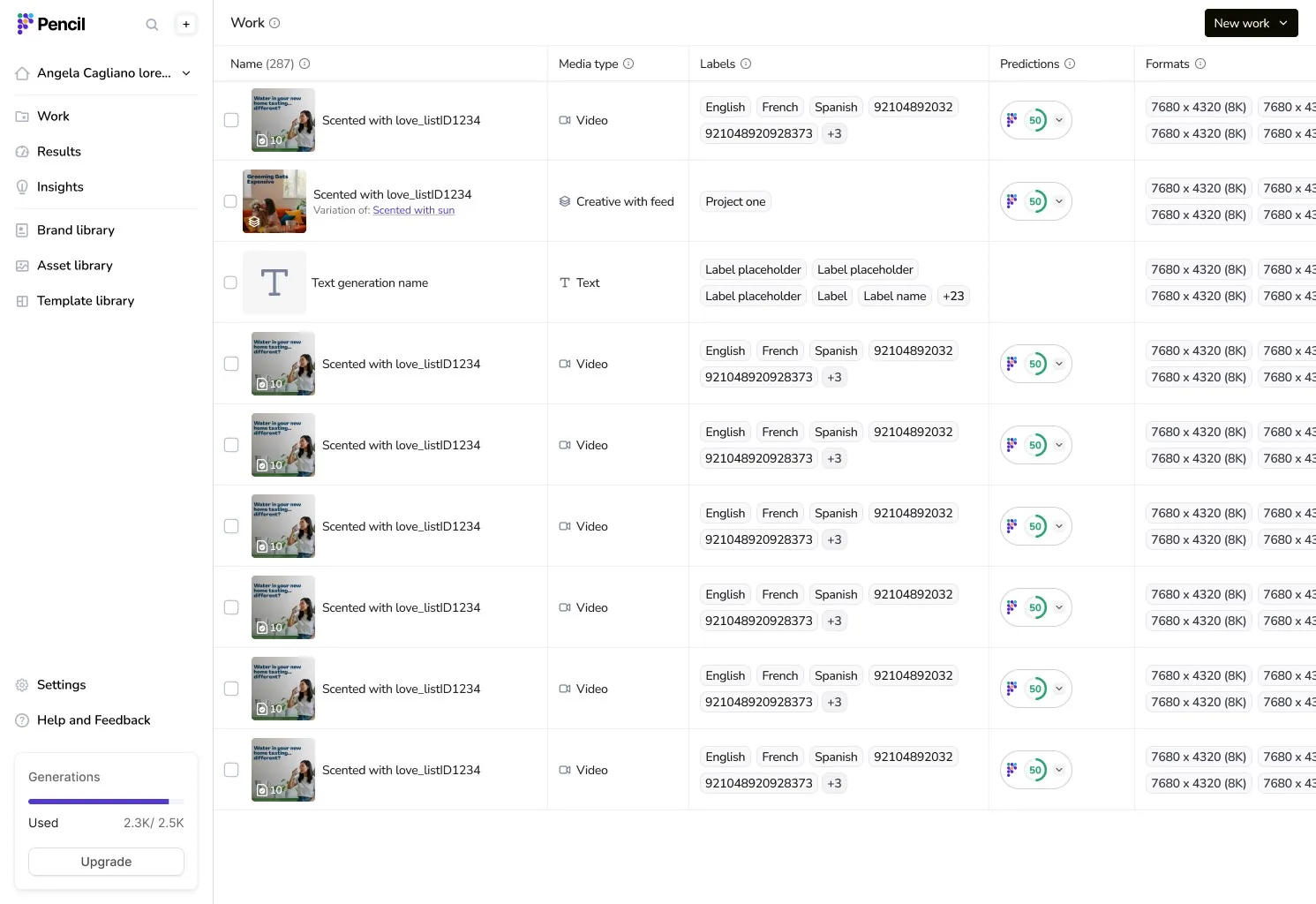
The new Work page. Every creative, variation, image, video and piece of copy in one place.
Shift 1
One workspace and one search
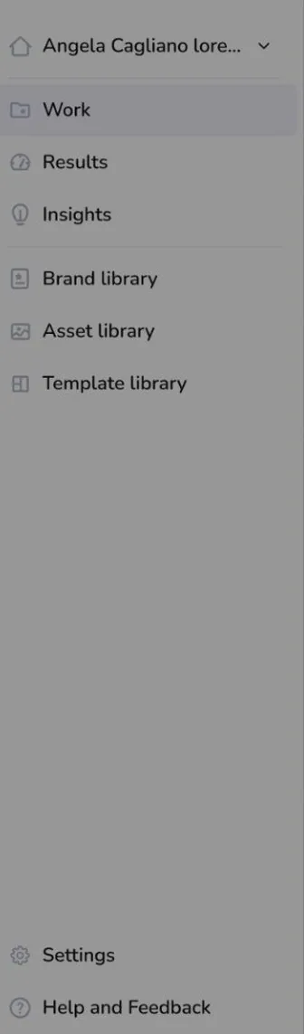
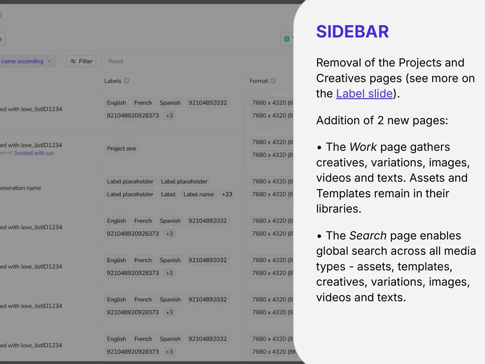
Projects and Creatives came out of the navigation. In their place:
Work
A Work page that brings creatives, variations, images, videos and copy into one view.
Search
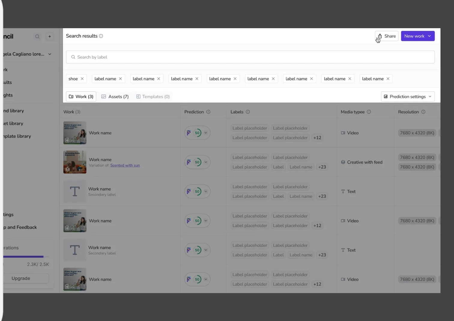
A Search page that finds anything by name or label, across every type of content, with results grouped and counted by type.
Asset Library and Template Library stayed, but now behave the same way as everything else.
Why it matters: the navigation now reflects how teams think about their work, not how the platform happened to store it.
Interaction detail
Search starts empty to encourage intentional queries, and a no-results state offers a one-click reset so users are never stuck.
The new sidebar, and the design rationale behind it: two pages replace four scattered ones.Search results grouped by content type, with counts and active label filters.
Shift 2
Labels instead of folders
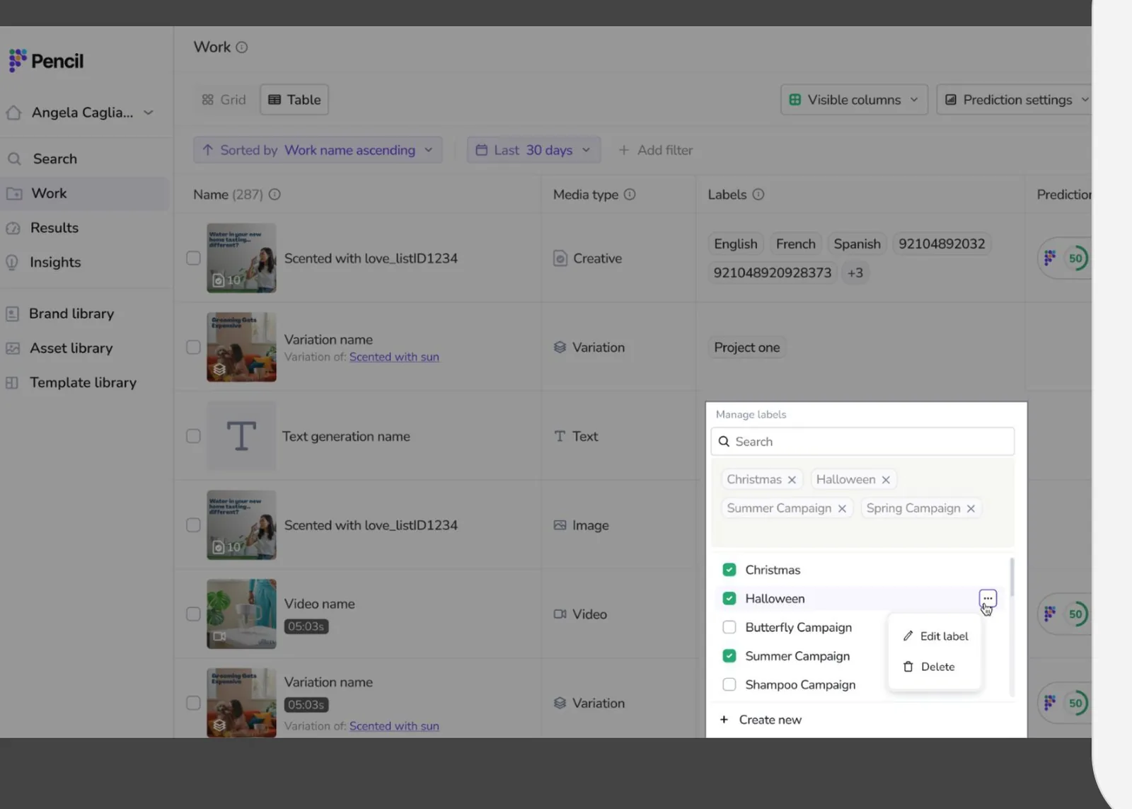
This was the biggest structural change. Folders forced every item into one place. Labels let one item belong to many: a creative can be tagged "Summer Campaign", "Spanish" and "Instagram" at the same time.
Every item also gained 15+ properties, including format, channel placement, approval status, export status, creator and AI prediction score. Each one can be shown in the table, filtered and sorted.
Migration was part of the design. Existing tags, project names and creative projects were converted into labels automatically at launch, so users arrived at the new model with their work already organised.
Interaction detail
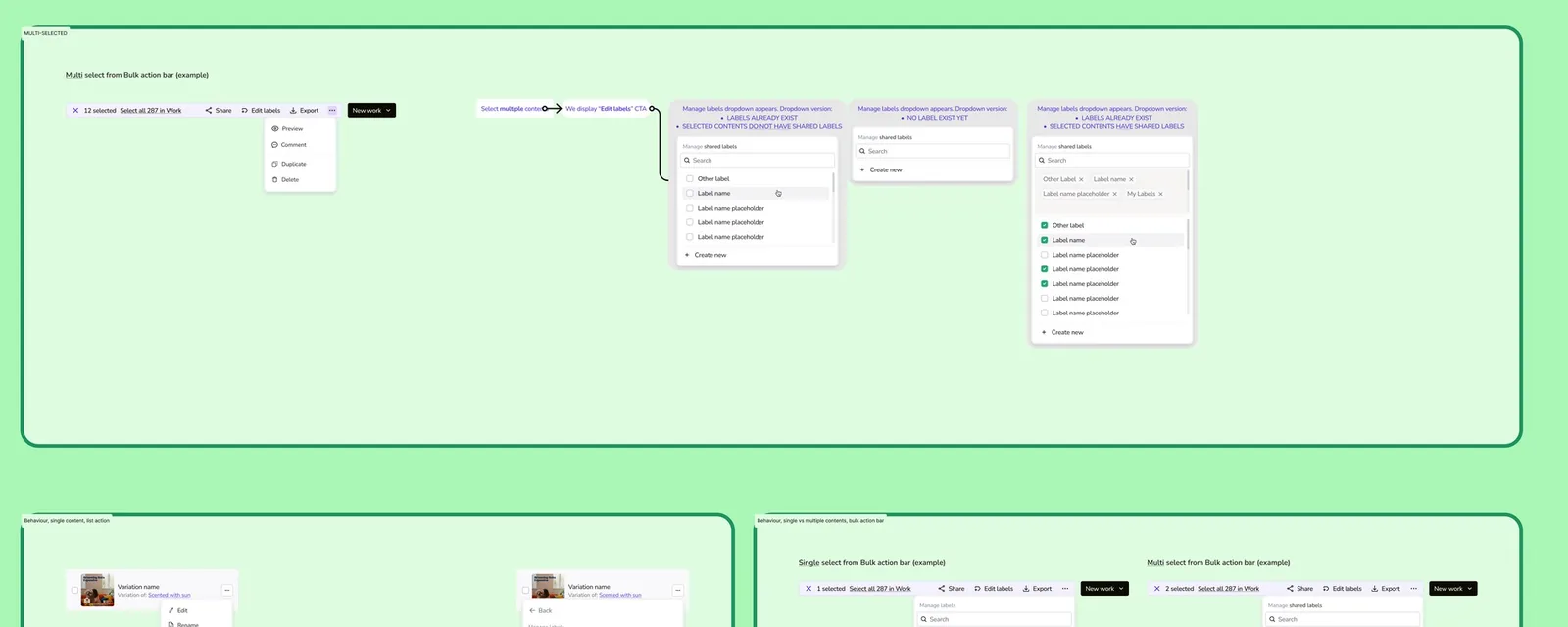
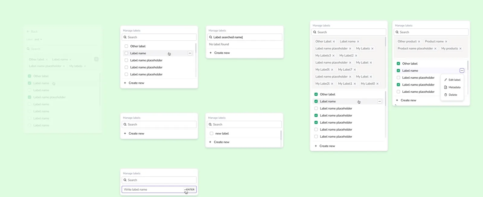
When labelling many items at once, the label dropdown handles three different situations: no labels exist yet, a label applies to only part of the selection, or a label is shared by the whole selection. Each has its own treatment, so bulk edits never overwrite labels by accident.
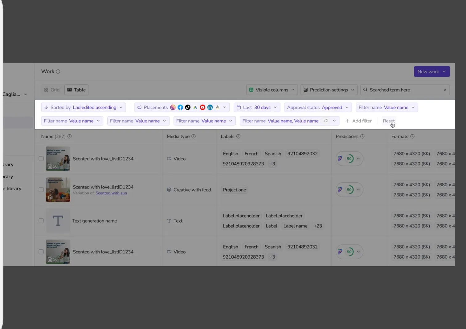
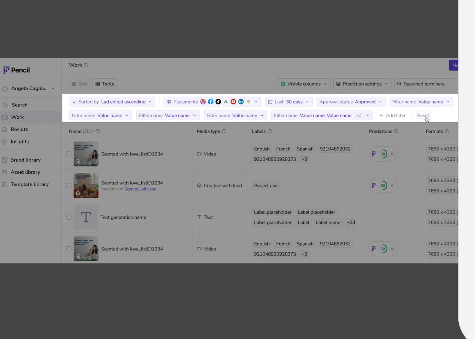
Managing labels on a single item.The bulk labelling flow, from multi-select to the shared-label dropdown and its three states.Properties in action: labels, prediction scores and formats on every row, filtered by placement, date and approval status.
Shift 3
Tools for managing at volume
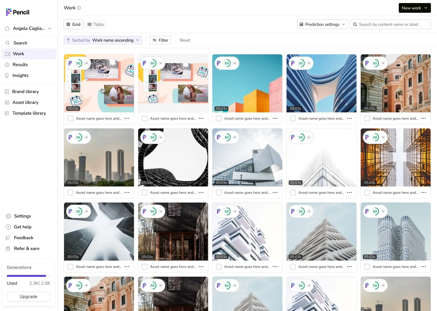
Grid and table views.
Switch between visual browsing and a dense, database-style table.
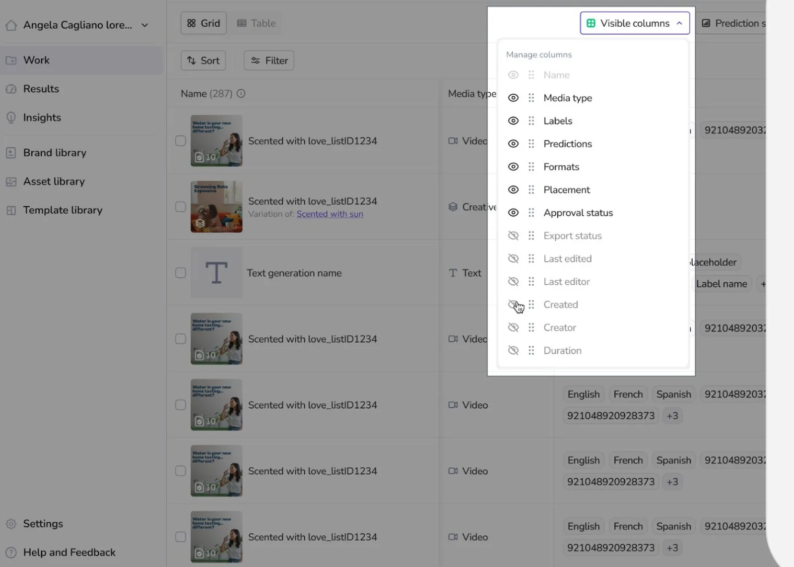
Configurable columns.
Show, hide and reorder any property.
Multi-property filtering.
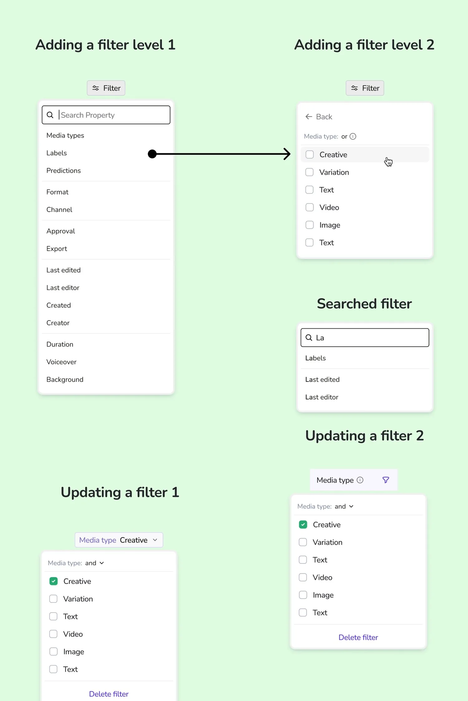
A two-level dropdown: choose a property, then choose its values, with search to find properties fast.
Views you can share.
Filters, sort and search terms are saved in the URL, so a teammate opens exactly the same view from a link.
Select at any scale.
Pick single items, the current page, or every matching item ("Select all 287").
Context-aware actions.
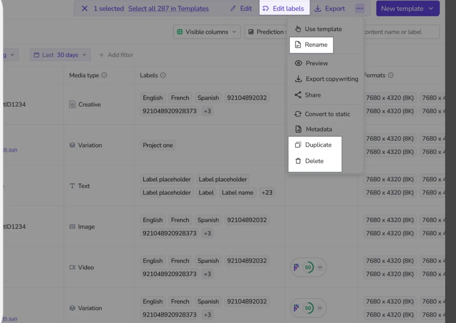
An action bar appears on selection and only shows what makes sense for that type of content. A creative offers Preview and Convert to static. An asset offers Remove background.
In practice: a campaign lead can filter to "Instagram Reels, English, approved, last 30 days", select everything and export the batch in one go. Before, the same task meant working page by page and file by file.
Grid view, built for visual review.
Toggle and reorder any property column.Several filters combined: placement, date range, approval status and custom properties.
Any filtered view becomes a link a teammate can open.The action bar. "Select all 287" extends any action to the entire filtered view.
Shift 4
Start new work from anywhere
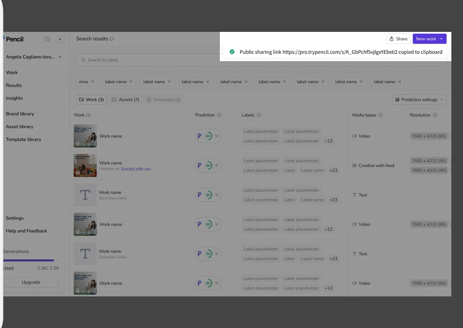
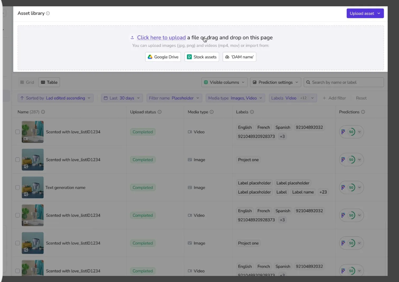
Every page has a persistent New work or Upload entry point, so users never have to leave what they are doing. Uploads accept drag and drop, Google Drive, stock libraries and DAM integrations. New files can be labelled and renamed in bulk as they come in, so organisation happens at the start instead of piling up later.
Uploading to the Asset Library from any source.
The system behind it
I built the component library in parallel with the screens: headers, filter dropdowns, sort bars, label management, format and channel cells, and action menus for each media type. Every component was documented with its variants, edge cases (empty, loading, error, overflow) and interaction notes.
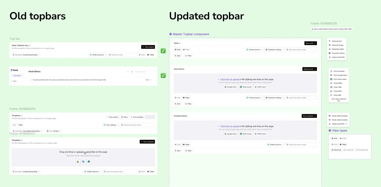
This is what made nine sprints possible. Four bespoke top bars became one master component, configured per page. Engineers built from specs, not screenshots, and once a component was approved it shipped identically everywhere it was used.
Before: a different top bar on every page. After: one component, configured per page.The filter interaction model: add a property, choose values, search, update, remove.
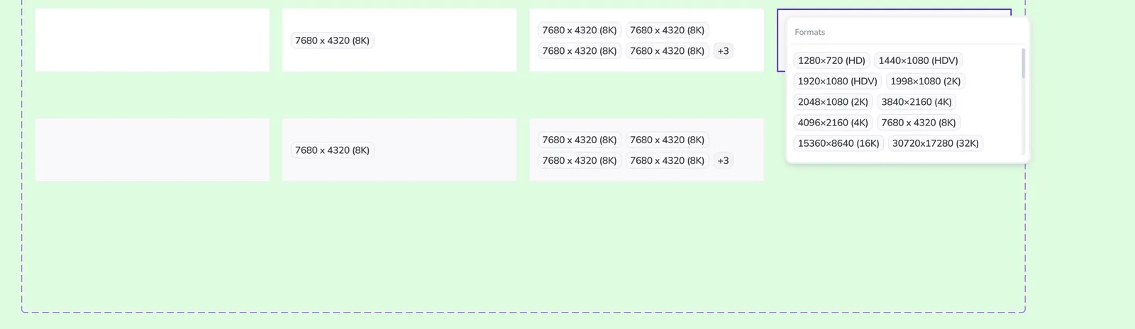
Label management states: empty, searched, multi-select, inline edit and delete.Format cells: empty, single, multiple collapsed and expanded.
Before and after
The same content, rebuilt around one consistent system.
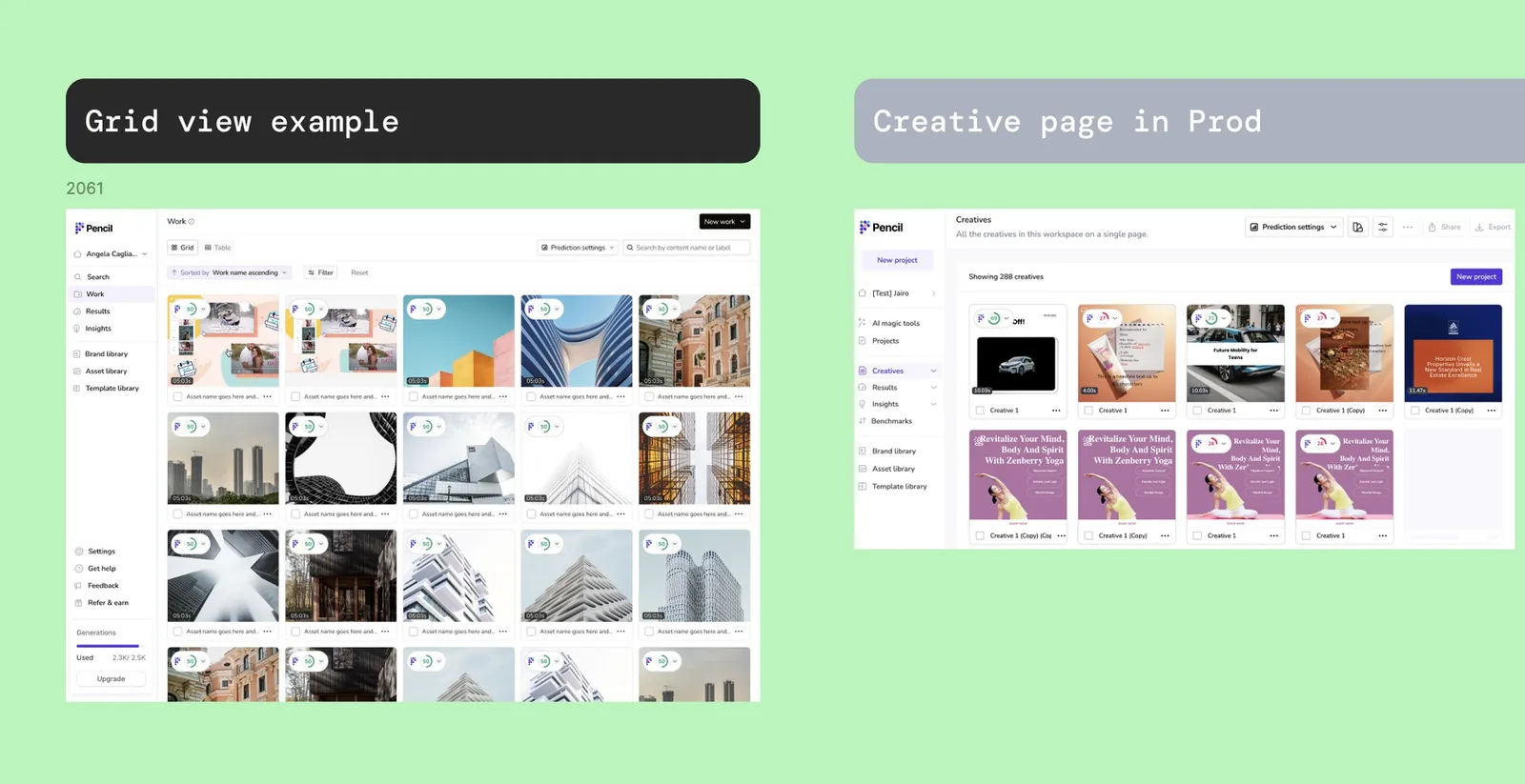
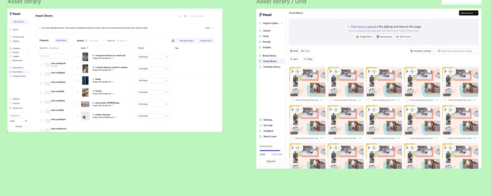
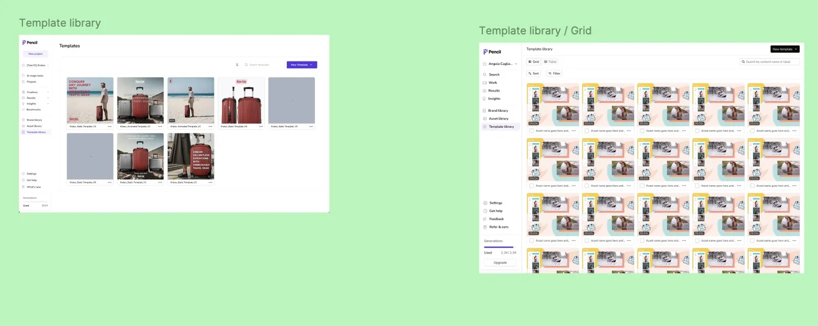
The new Work page (left) and the Creatives page it replaced (right).Asset Library, now sharing the same upload, label and filter patterns as every other page.Template Library, rebuilt on the shared top bar, sort and filter components.
06Impact
What it changed
Shipped on schedule.
The full redesign across Work, Asset Library and Template Library was delivered in nine sprints.
One workspace instead of four.
Teams now see, find and manage all their content in one consistent place.
Batch work replaced repetitive work.
Labelling, renaming and exporting went from one action per file to one action per selection, however large that selection is.
Built to last.
More than a year on, the design is still in production. The platform has since pivoted toward AI-centric generation, and the workspace and its component system came through that shift with only minor changes.
Faster to build.
Engineers implemented each component once and reused it across every page.
Running at scale.
It supports global brands managing thousands of AI-generated creatives today.
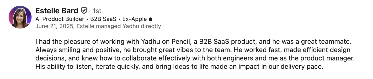
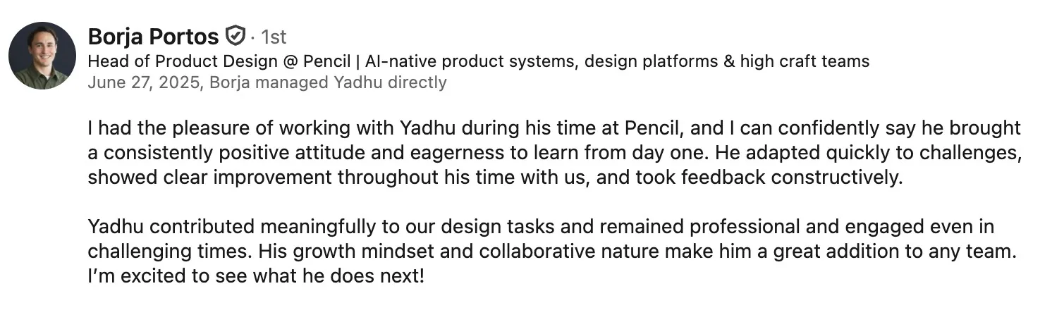
What the team said
Written when I moved off the project, by the two people who managed me directly.